english-for-designers
Final thesis presentation
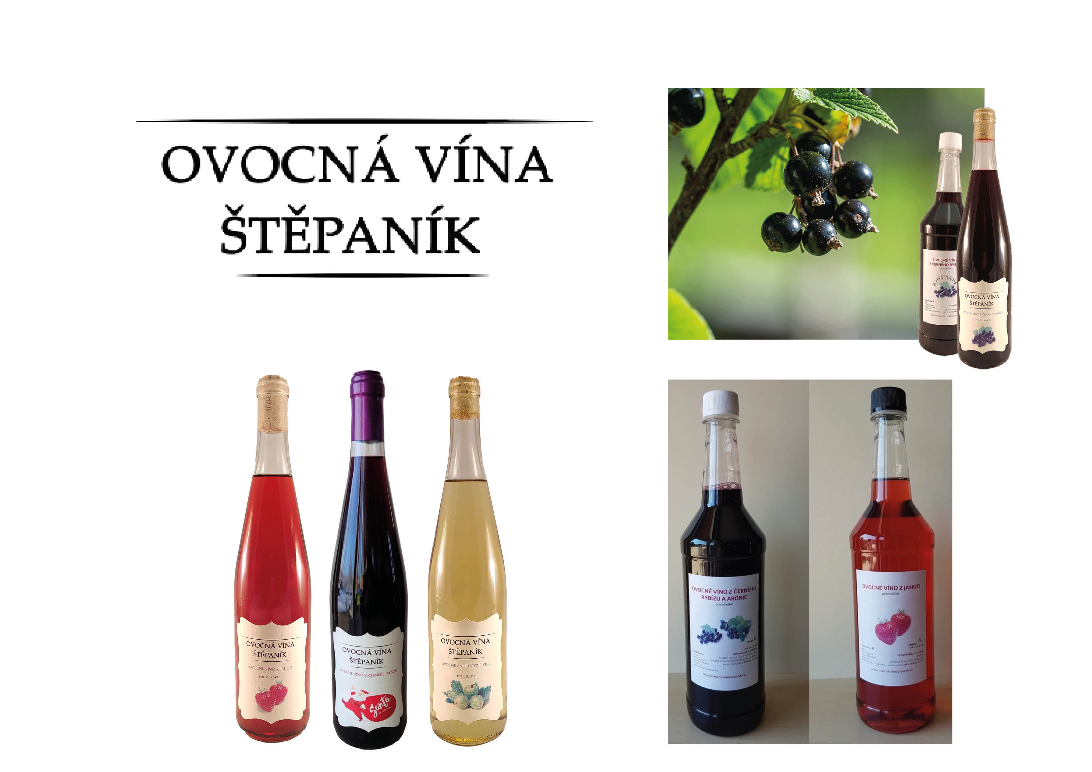
I chose to redesign the visual style of a small fruit winery.
I liked that the winery produced its wines with respect to nature, but they’re not able to present them in a better way.
I chose this winery because they make their wines naturally and without unnecessary sugar and chemicals.
So at first glance, it was me like a winery be good for using my illustrations what I do. Because of the company philosophy and their respectful connection to nature.
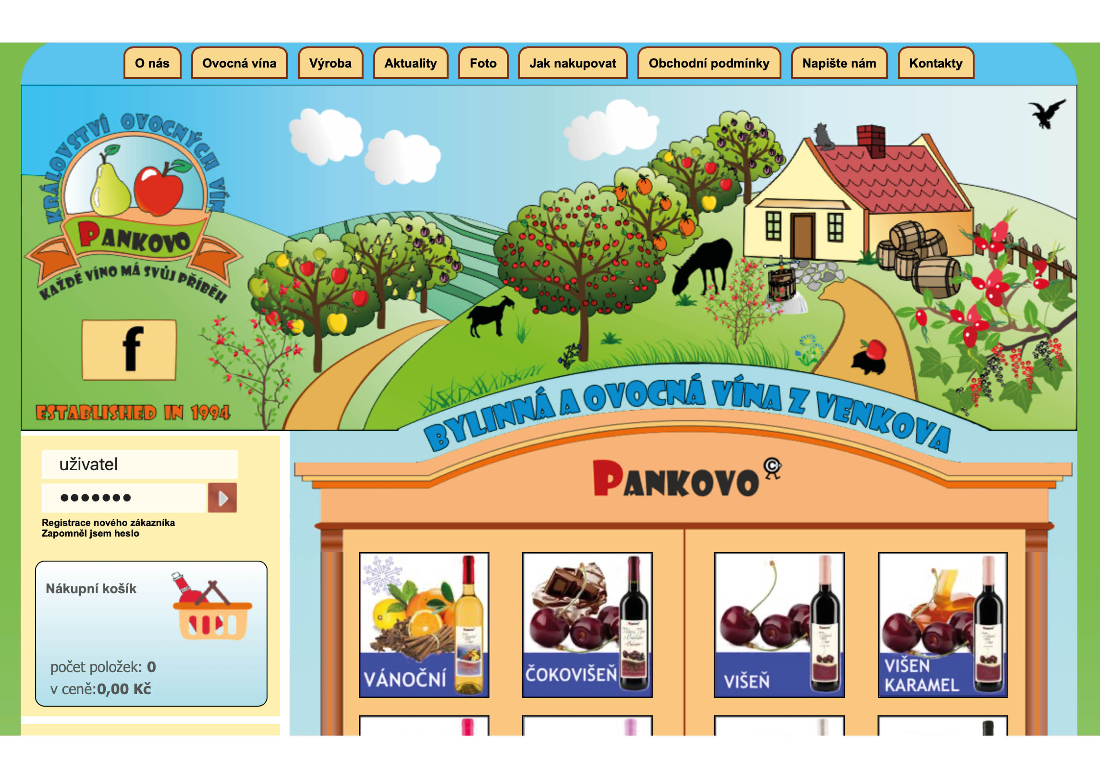
There you can see the web design that they use. They try to point out their relationship with nature but not in the right way.
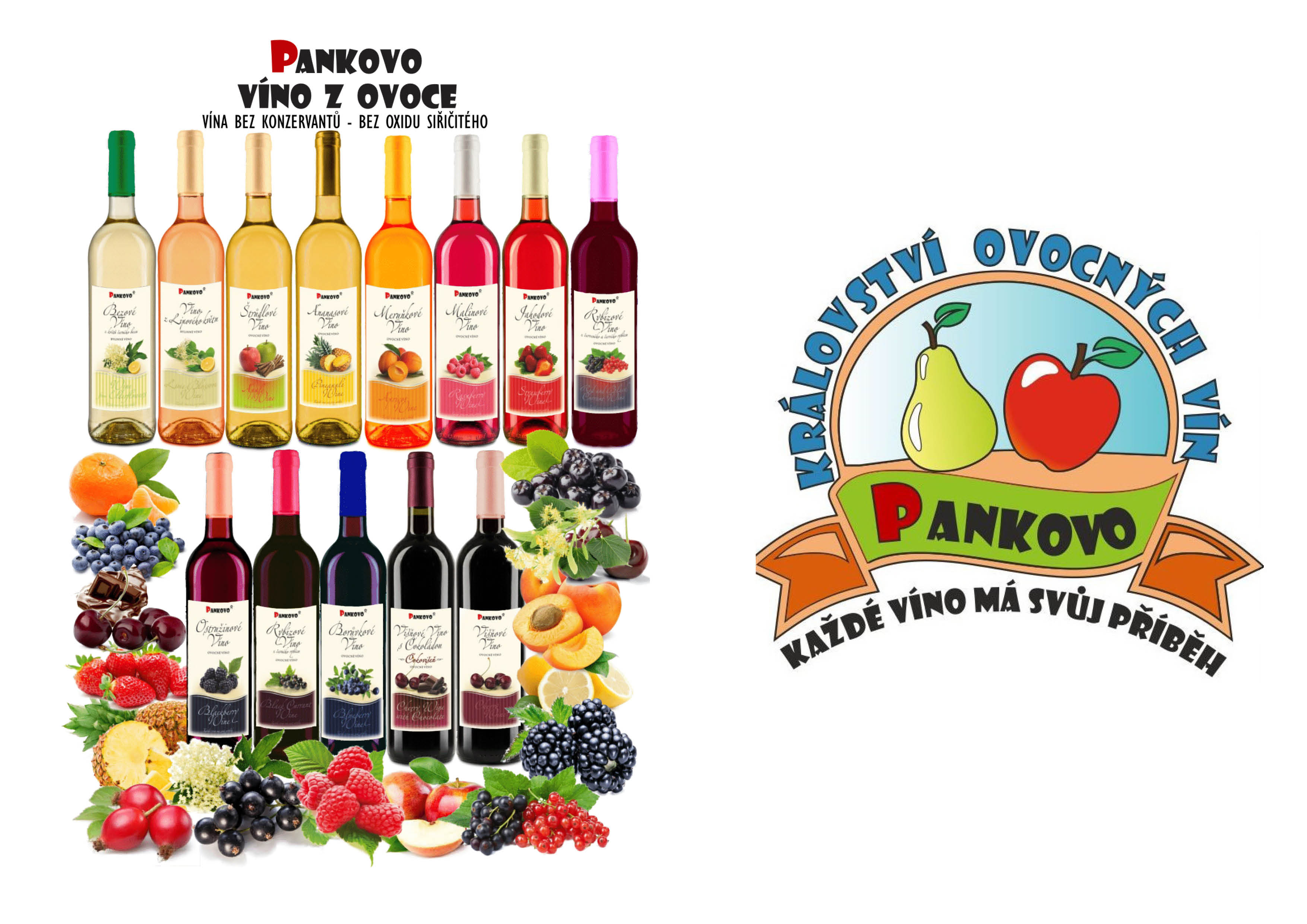
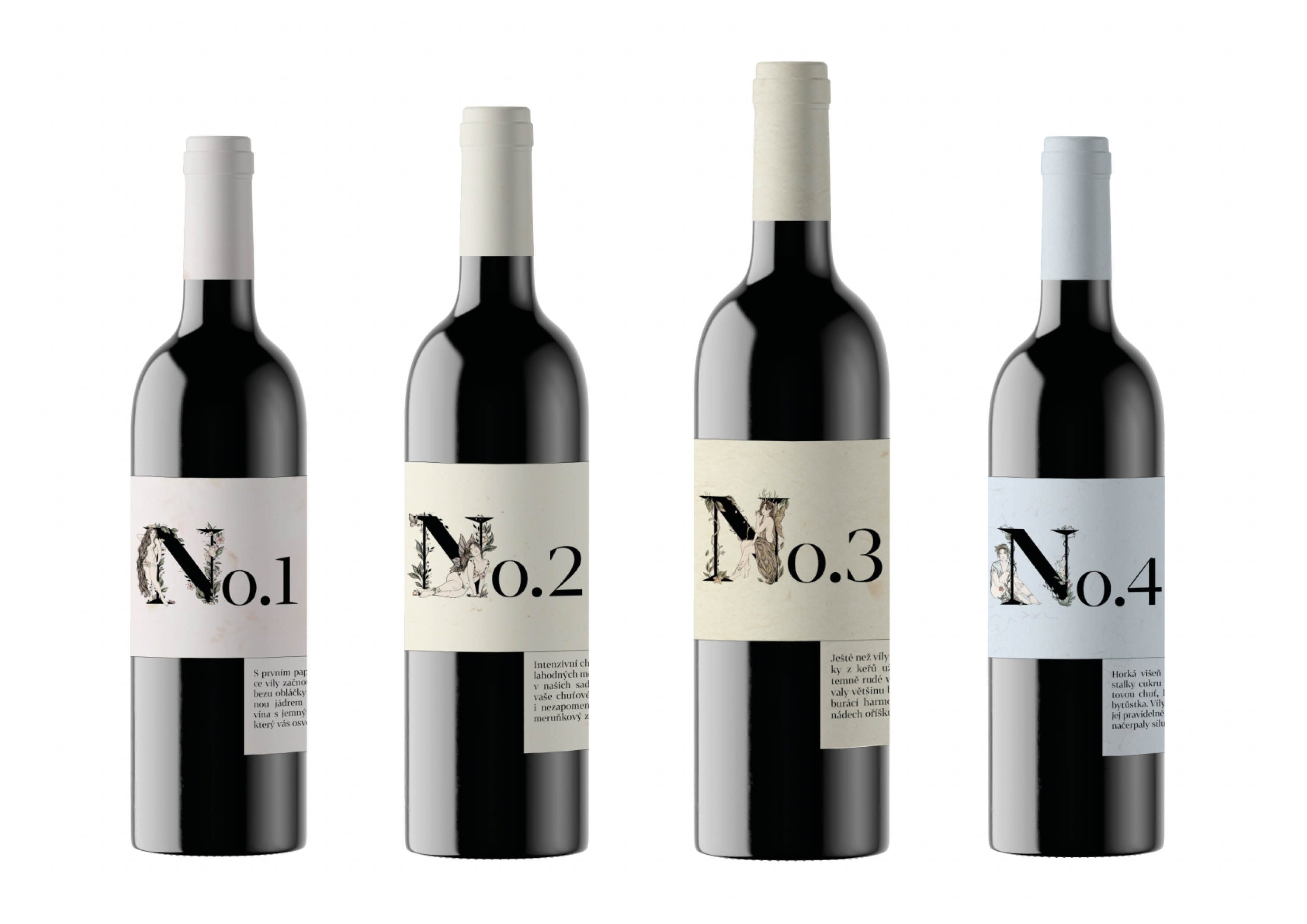
Labels for their wines are visually connected together, but it doesn’t seems different from others. They are not significant on the market.
Research
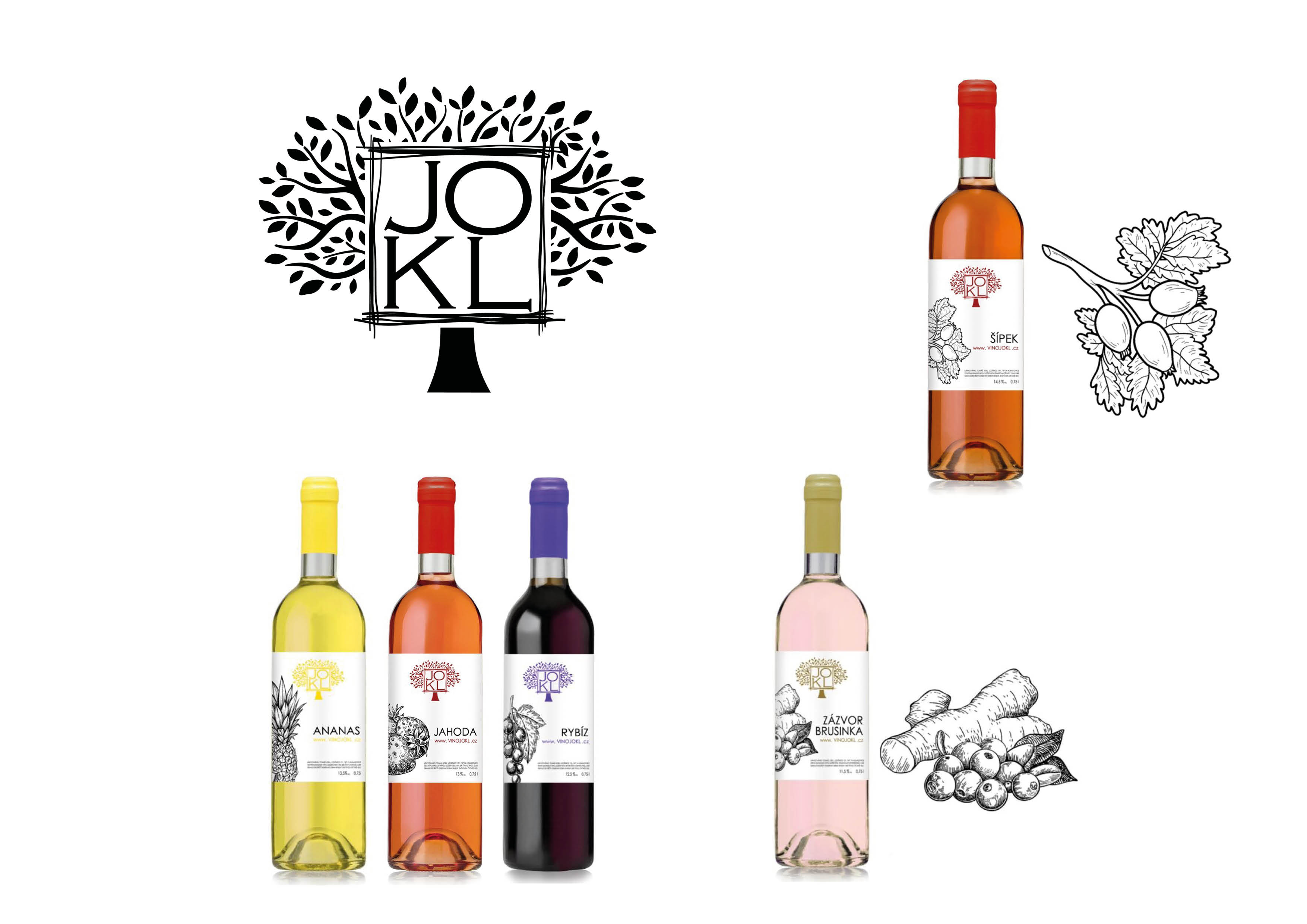
I did some research to identify the company’s competition.
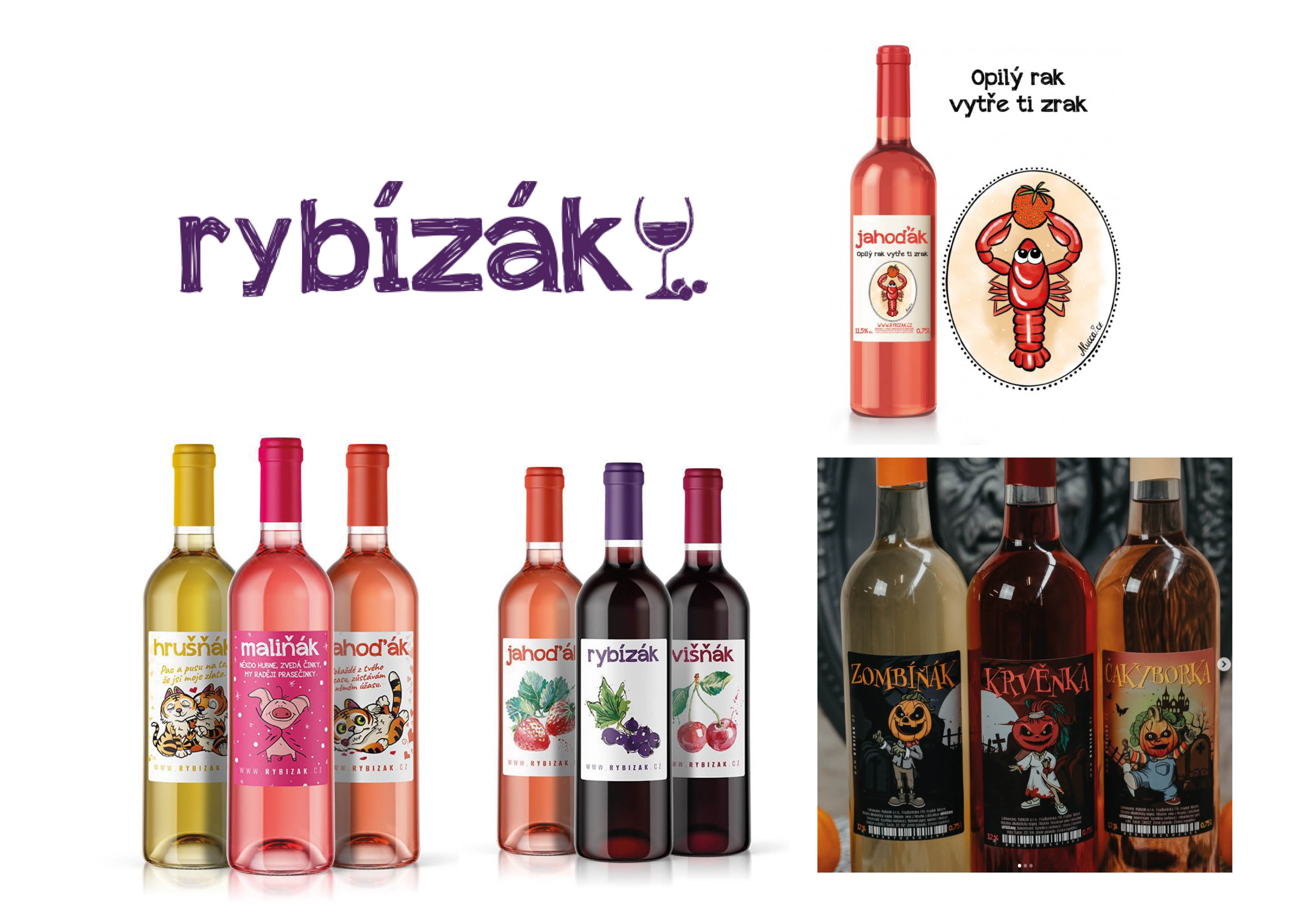
This is the biggest producer of fruit wine on our market. They have limited editions and very expressive labels.
And because of the visuals, they also seem like cheap versions of the fruit wines.
But against others, they communicate with their clients somehow.
This is another competitive company that doesn’t stand out at all in the market.
And more. They have in common that both labels are not distinctive and probably uninteresting at the first glance.
First idea
I’ve been thinking from the beginning that I wanted to work by using illustrations and telling a nature fairytale story.
I was looking for the place where the wines are made, could be connected to something supernatural.
And I found the connection of classic Czech devils to the place that is close to the winery.
But as it happens, my advisor disagreed.
First skeches
First sketches
So I kept looking, and after a while, I came up with the idea of connecting the wine to the fairies that are connected to nature on a different level than devils.
Here you can see my first sketches and how I tried to add a fairy word to the label. At the same time, my advisor and I decided to put wines into four categories.
So from here, I knew the way I want to go.
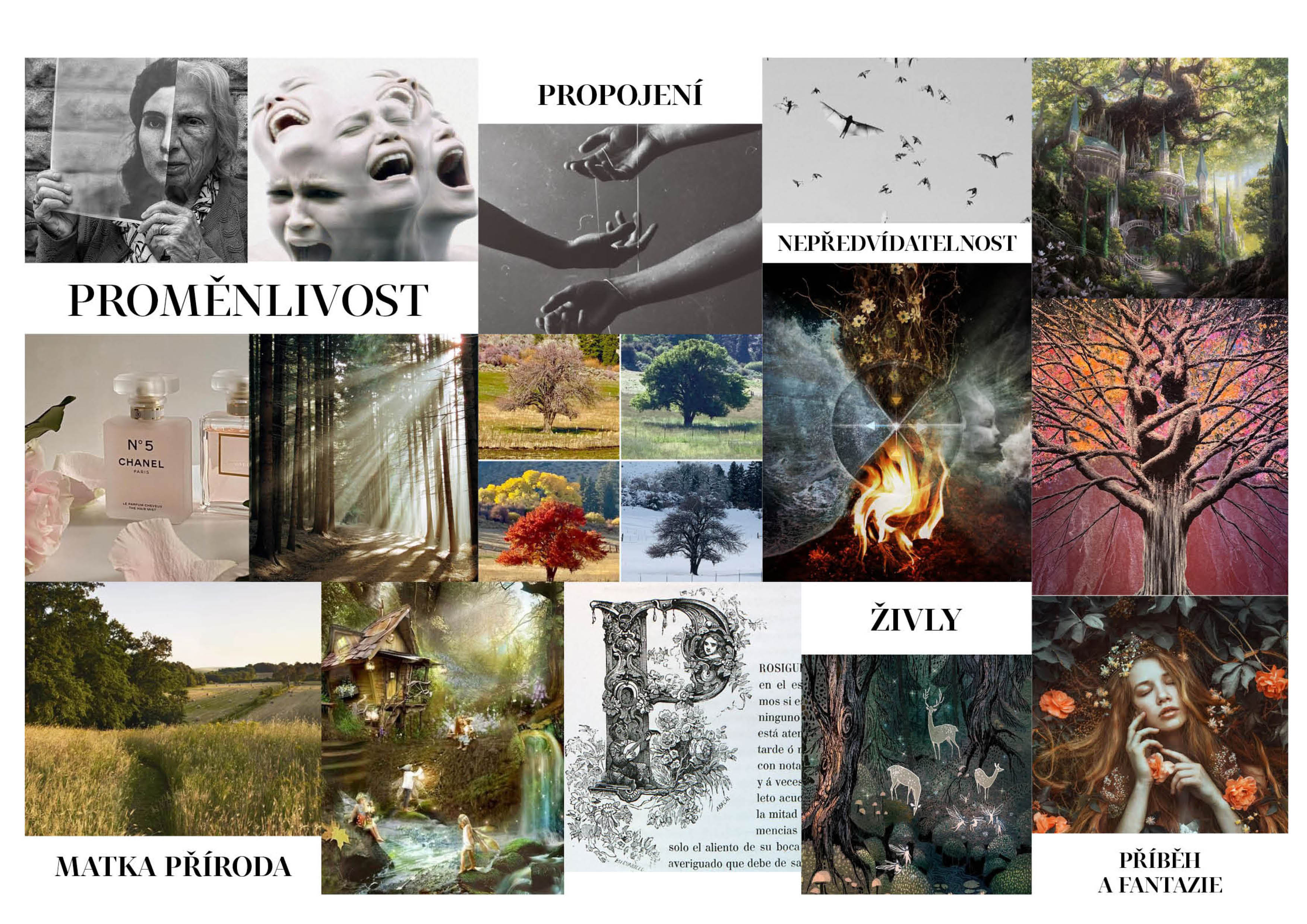
Moodboard
My inspiration was mainly the variability of nature, the connection with it.
The elements of unpredictability and mother nature herself.
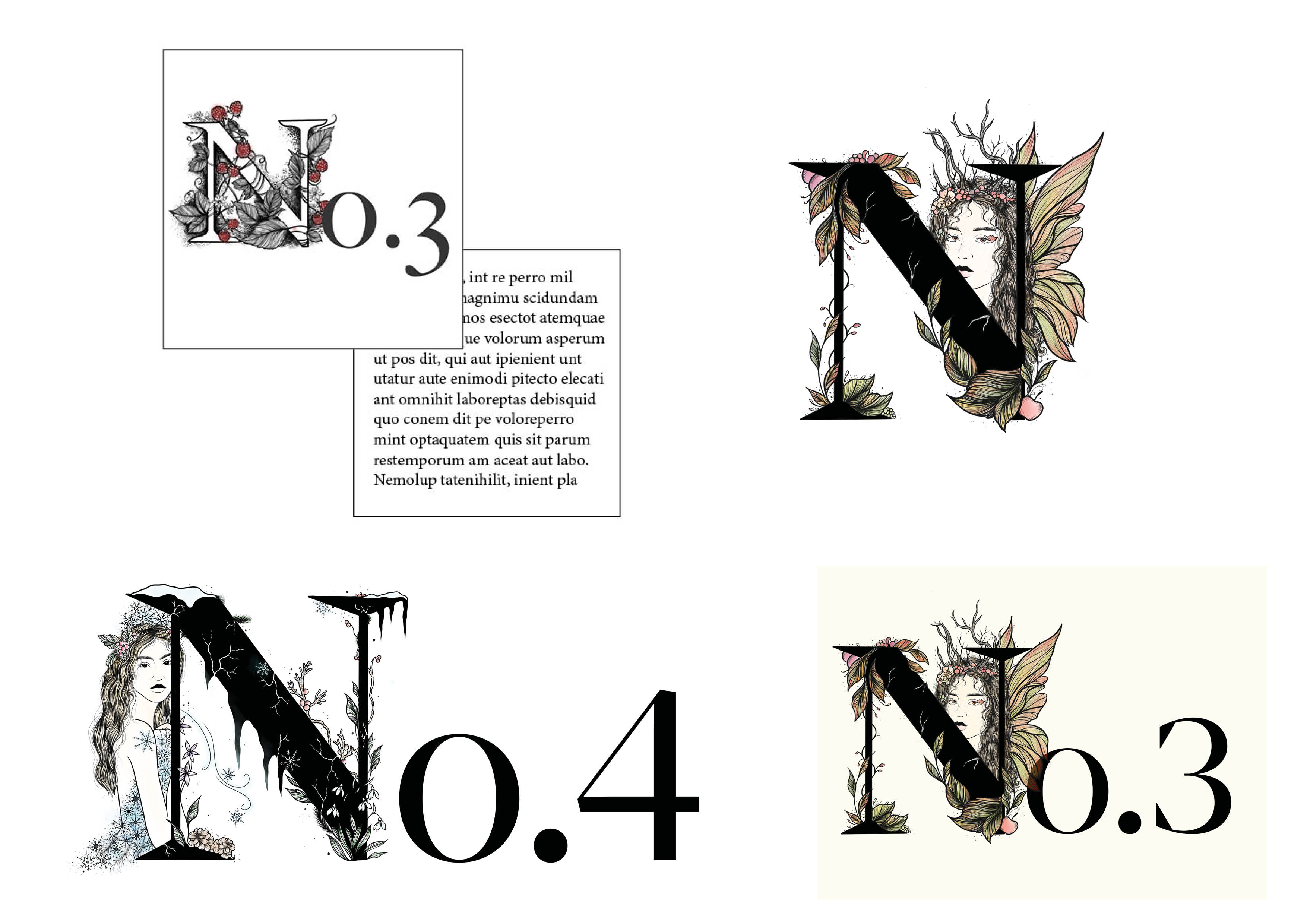
I also wanted to add a fairytale wine story to the brand. I try to show this with a fairytale dropcap.
I was also inspired by Chanel and its name. This helps to keep unity and fairytale secrets.
Logo
I kept it simple because the logo isn’t the main communication element.
So I let it rotate according to how the sun rises in the seasons.
In the summer, for example, the day is the longest, so I chose the longest position of the letter “o.”
![]()
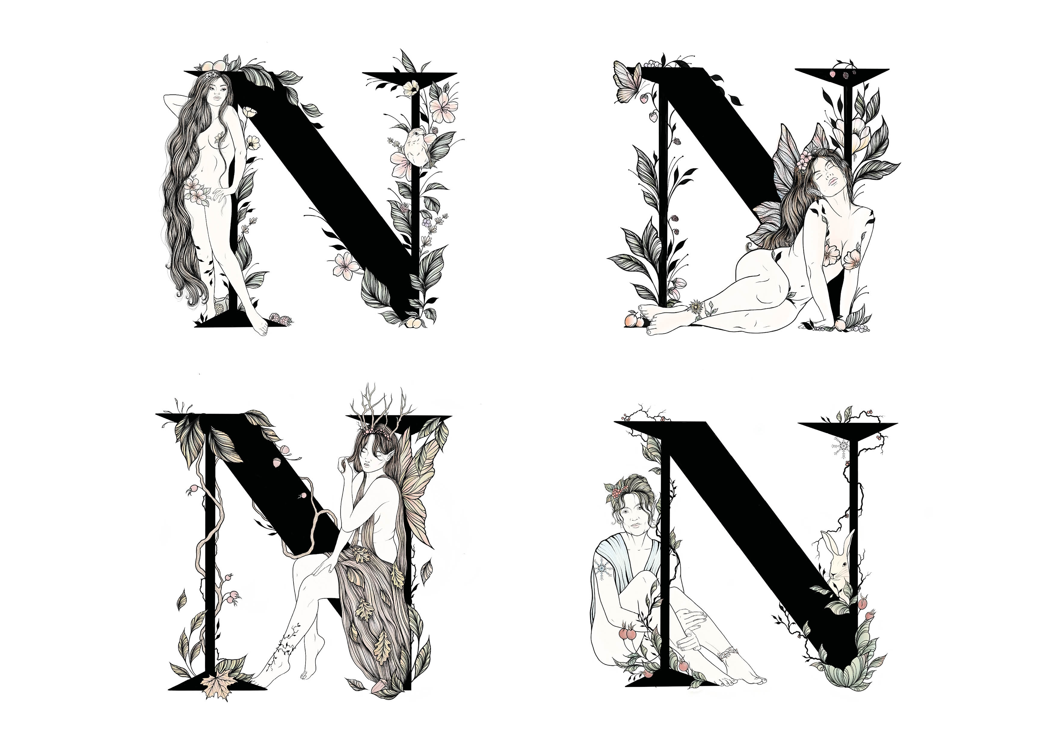
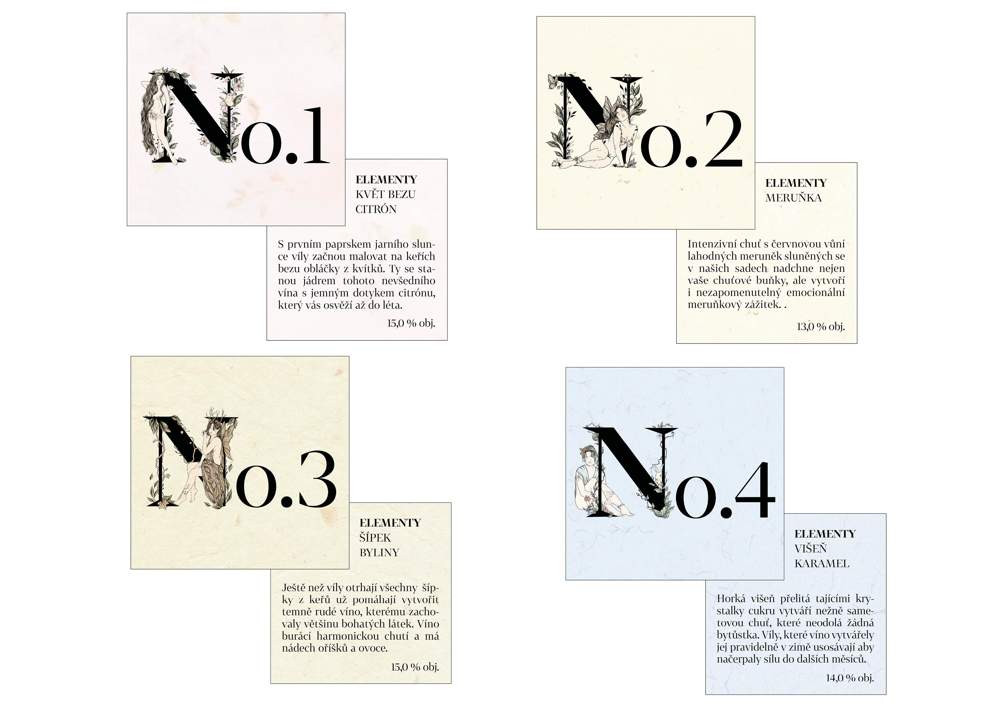
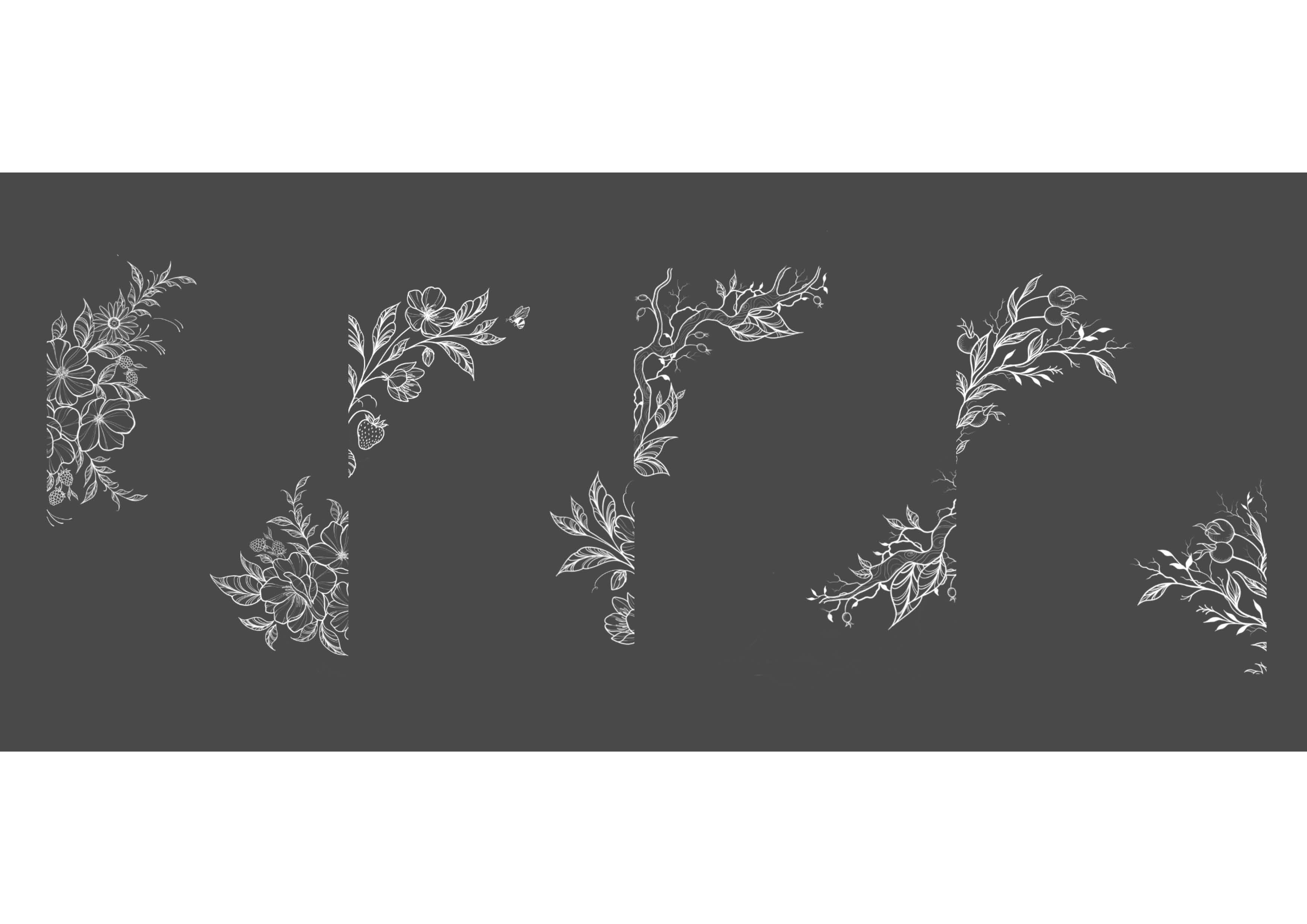
Ilustrations
Illustrations were made to reflect the seasons and taste of wines.
The four categories are reflected in their names. This helps to create a unified visual style and makes it possible to classify the wines according to taste and freshness into these categories.
Pattern
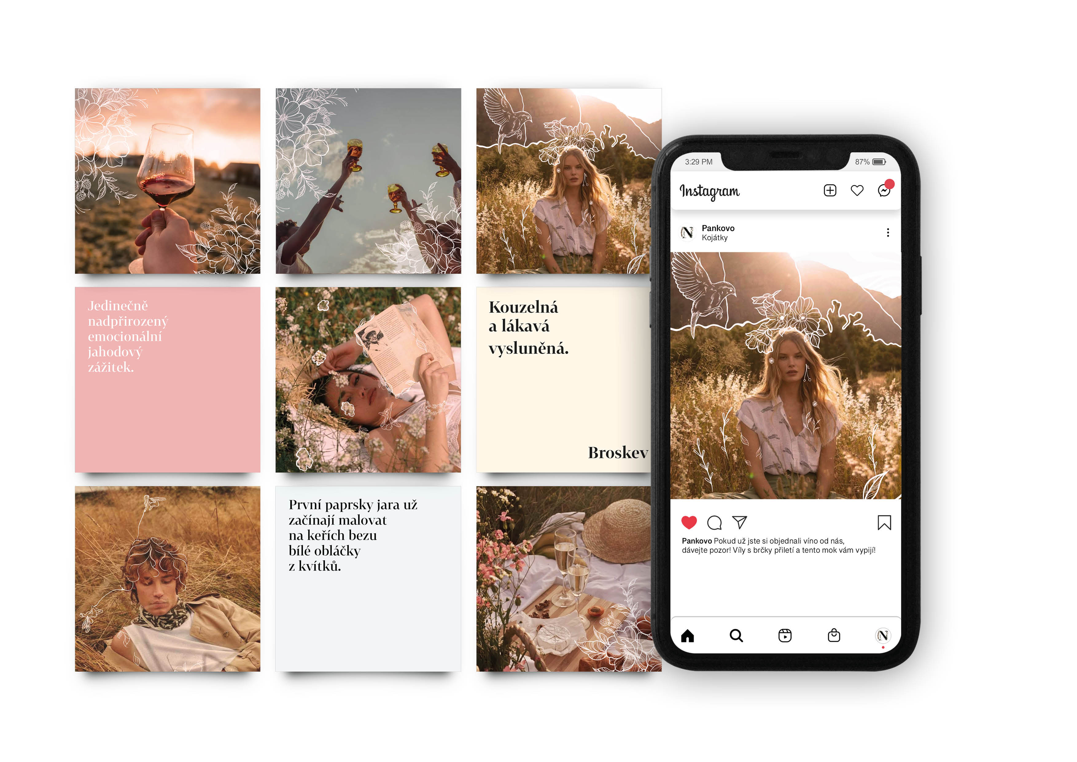
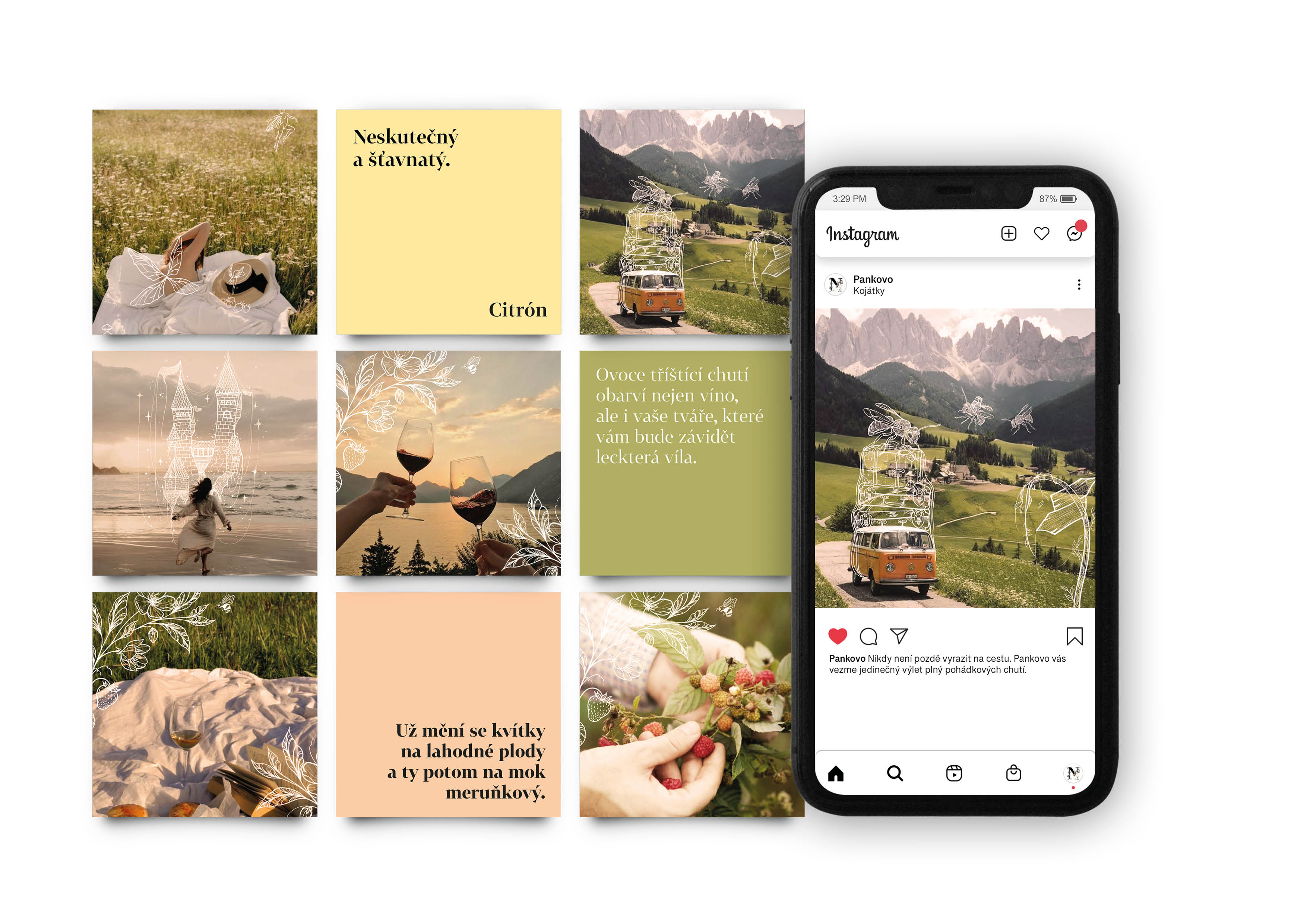
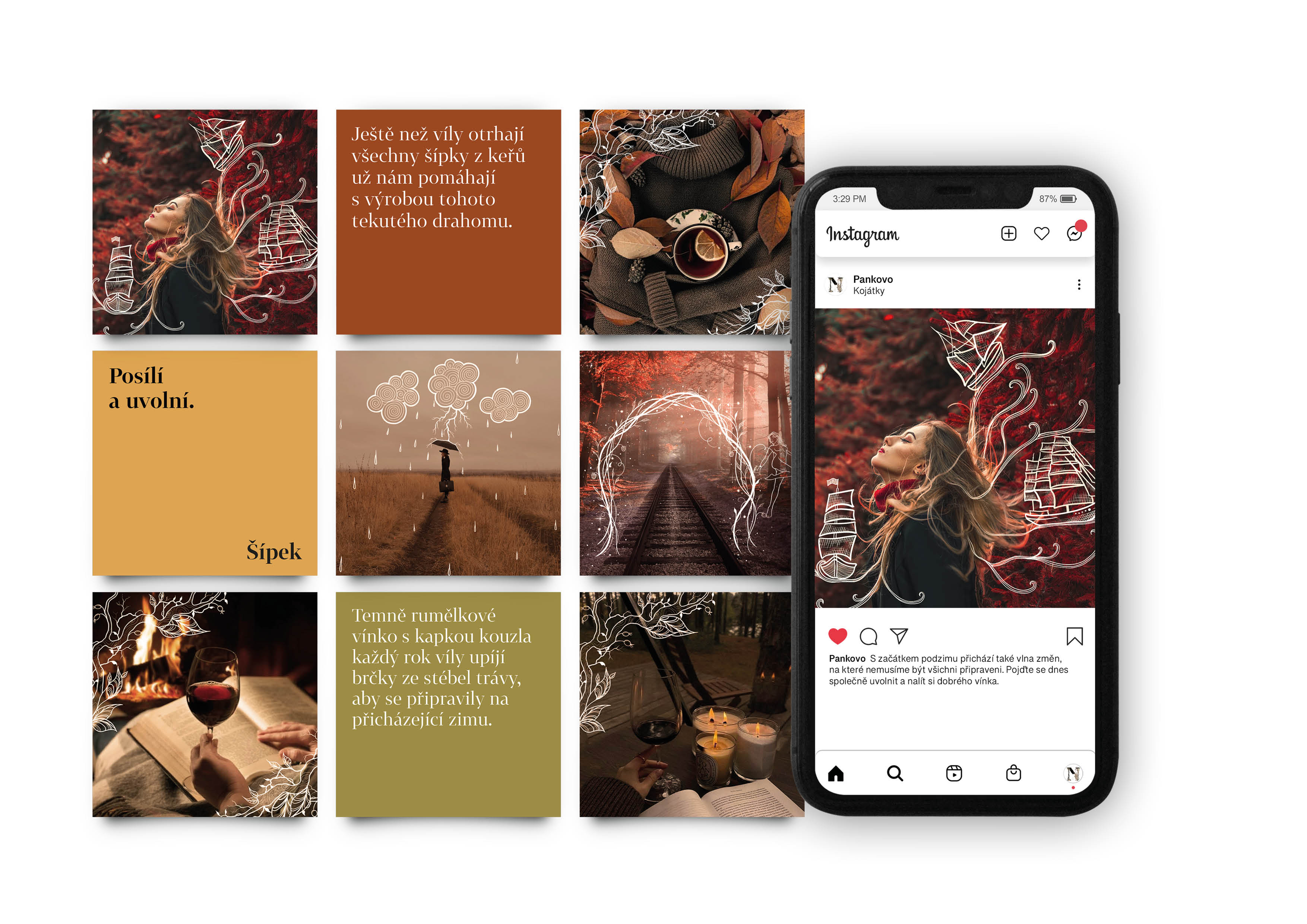
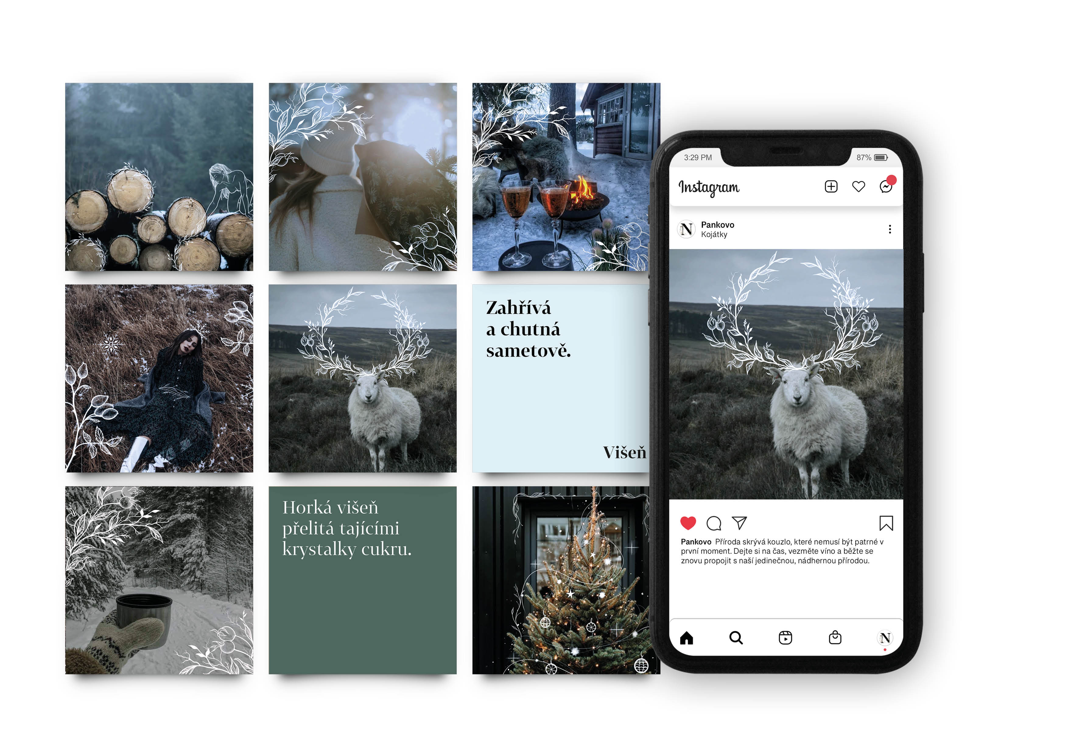
For the winery’s social media, I created a pattern that they can use as they want. Instagram communicates by seasons while keeping the same visual style.
The company should communicate on Instagram differently in each season both with color tonality and overall atmosphere to attract customers to the products that are most popular at the given time.
In summer, for example they promote the freshness and lightness of wines.
In winter, on the other hand, wines with more pronounced flavors that can be warmed up so that clients can enjoy them by the fireplace and good food.
On the proposal I connect the everyday world and incorporate a fairytale world into it.
With this the company tries to inspire unique experiences and develop the customer’s imagination not only when drinking Pankovo wine.
I use illustrated photography that aims to point out the fact that Pankovo winery thinks about nature and its gifts in a different way.
For photos that focus more on products, such as photos of wines, a pattern is designed for use by the owner.
I always apply the text to a uniform colored background in the totality of the given period.
I present the ideas of the concept as a relationship with nature and the telling of fairytales.
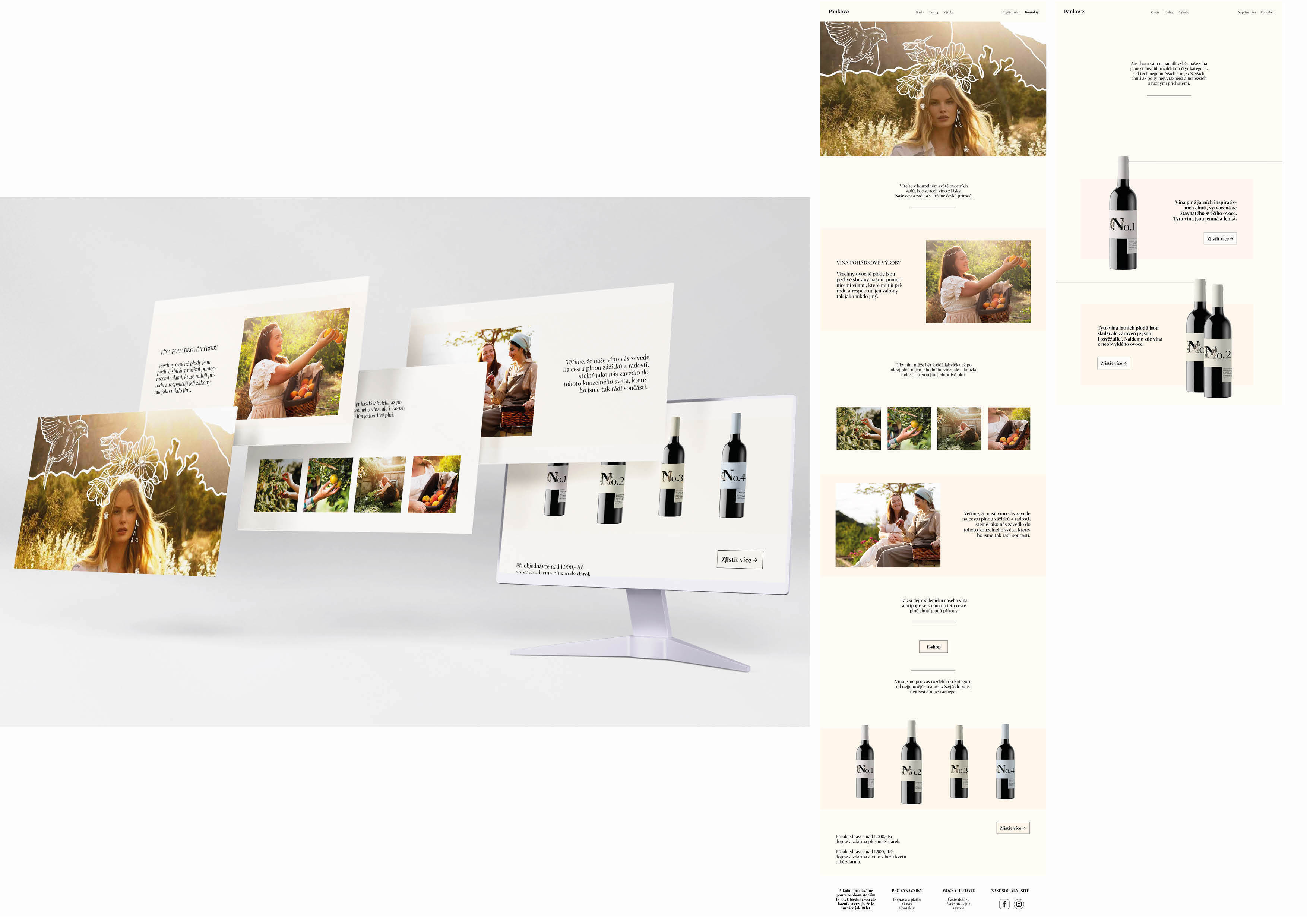
Web
I made the website in such a way that it visually matches the whole identity of Pankovo.
The customer gets to know the philosophy of the company and its story.
Here I emphasize nature and relationships.
The world of fantasy is shown only on the homepage where I insert the white illustrations directly into the video which customers will see first.
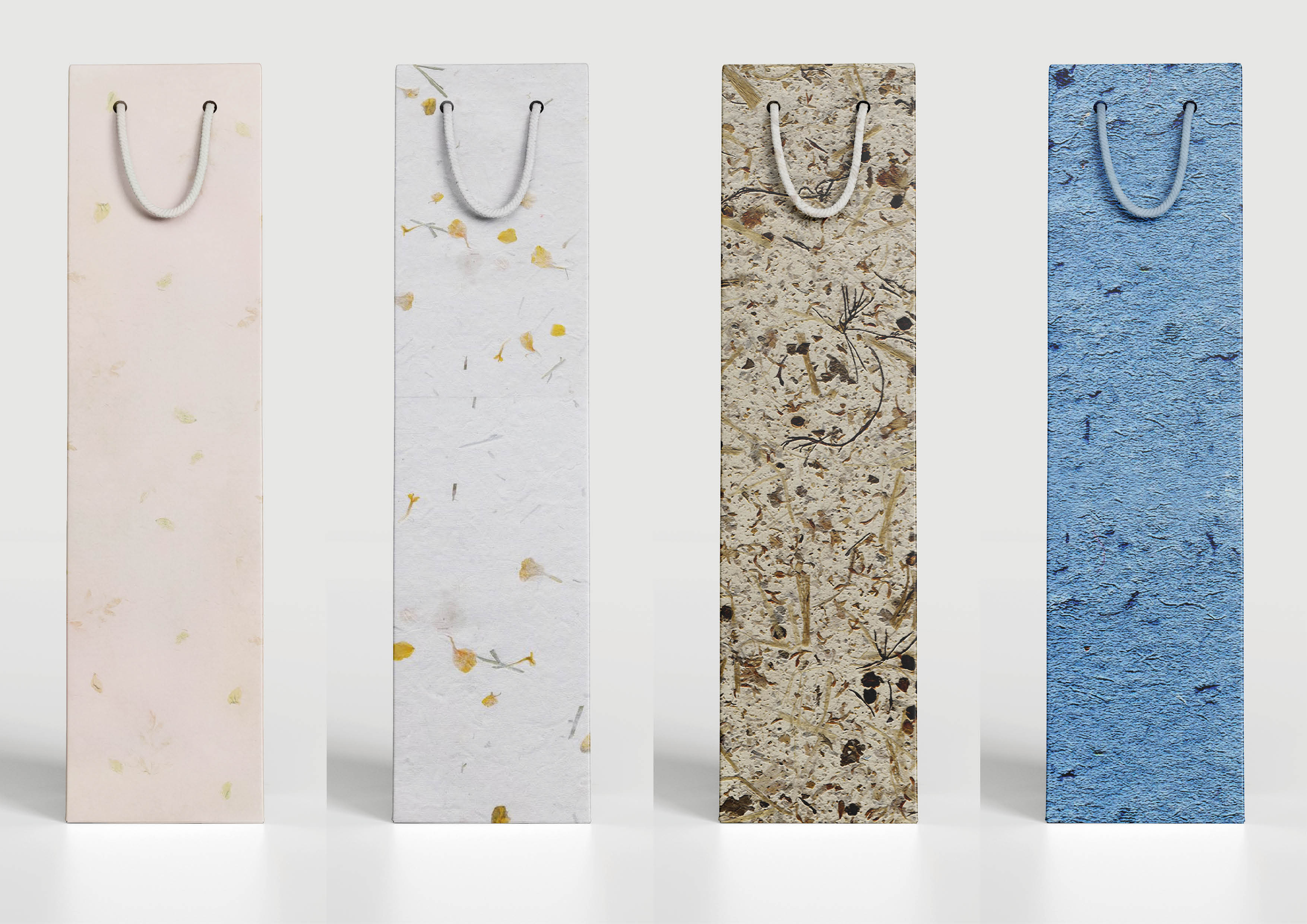
Wine gift bag
I chose a gift bag made of durable, handmade paper as a gift for purchases over 1000 CZK.
As part of sustainability, we can insert fruit seeds into the paper when making the bags.
If the bag was no longer usable, the customer could use its added value, plant it in the garden, and let it grow, for example, a beautiful currant bush.
I show the various seasons in the bags with the help of their colors, the elements inserted into them, but also with their structure.